3 Android games I've enjoyed lately: Riddle Zen, Smashing Simulator, Idle Game 1 📲
Okay yes, I’m still playing Idle Iktah primarily. However, I’ve managed to spare a moment or two for other Android games! Here’s the 3 I’ve enjoyed in the last few months of 2023.
The games are in descending order of “fun”, and might contain mild spoilers:
#1: Riddle Zen
You know those annoying riddles, like “When is a door not a door? When it’s ajar”? What if there was a whole game based on them! That’s Riddle Zen, an early access game.
Review
This is a pretty simple game, with the core gameplay always consisting of picking the correct answer from the 9 options. Whilst the core gameplay is relaxing problem-solving, there is a timed version that I found very frustrating. The default game uses a standard life system, encouraging short sessions.
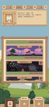
Completing puzzles will reward you with “zen”, to be used to upgrade “plants” that you can occasionally unlock. These provide nice permanent progression, as there’s a whole range of collections that provide lots of hints and level skips if fully completed.
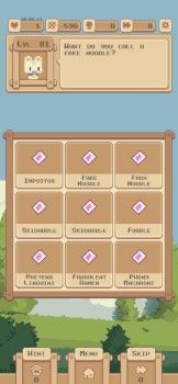
Whilst I’m pretty impressed with the game managing to contain literally hundreds of riddles, their quality varies! Some of them are clever, and the “Why?” explanation when you complete it is satisfying. Others are just intentionally tricking you, or seemingly nonsensical, and have to just be completed via trial and error.
Finally, most of the puzzles have cute little pixel art for each answer, which is a much appreciated bonus! It isn’t at all necessary, but gives you a bit more to look at whilst you try to figure out the riddle.
Monetisation
Unfortunately the game is heavily monetised. There are forced video adverts every few puzzles, plus tens of in-app purchases for hints, permanent perks, in-game currencies, everything you’d expect.
The forced video ads mean I avoid playing much, and the sheer number of purchases mean I’m hesitant to buy the ad removal. I didn’t purchase anything due to the aggressive monetisation.
Tips
- The game is trying to trick you. Read carefully!
- Navigation around the app is pretty confusing, luckily you don’t need to access anything except the riddles often.
- There’s a very quiet discord, good for keeping up with release notes.
Screenshots
| Plant collection | Bad riddle | Good riddle |
|---|---|---|
 |
 |
 |
#2: Smashing Simulator
You really can’t beat a nice simple idle game, and that’s what Smashing Simulator is!
Review
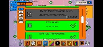
It’s a very straightforward game. Things appear on screen, tap the things to earn shards / other items. Use these items to unlock upgrades, autotappers, and repeat.
The appeal comes from the presence of multiple object types, and the ability to upgrade each of them. For example, you might upgrade bottles to the max, and eventually unlock poison bottles that have a whole different collection of upgrades.
I’m only a couple of hours into the game, and there’s definitely plenty more content to unlock. Even the Play Store screenshots show additional objects, new mechanics, even buildings!
Unfortunately, even the multiple object types and upgrades can’t cover up the fact that the core part of this game is a simple clicker. Progress is mostly of the “spawn X faster”, “get X% more X per tap”, “autotap every X seconds” style, where none feels very important.
It’s a good example of an incremental game, but needs some additional complexity at the early game. Clicking falling objects can only hold your attention for so long!
Monetisation
The monetisation is very minimal: optional ads for temporary (but useful) boosts, and paying to remove ads / premium currency. None of it is at all required for progression, although the advert one is worth it!
Tips
There really aren’t any tips, just upgrade the highest level objects whenever you can.
Screenshots
| Upgrades | Gameplay | Statistics |
|---|---|---|
 |
 |
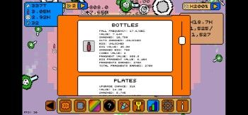 |
#3: Idle Game 1
Idle Game 1 (yes, that’s really the name) is an idle game that strips away any of the story, objects, or setting, and focuses purely on the prestige loop.
Review
I’m unsure how I feel about Idle Game 1. There is definitely a satisfying core to the game, but so, so much of the UI and progression feels like it actively dislikes the players.
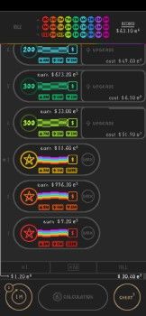
For example, the dark colour schemes with coloured highlights is very satisfying. Despite not having any reference point for whether a “layer” is an employee, a machine, a world, who knows, each has a unique feel due to their colour. Similarly, there are minimal animations, but those that are added help remind you the game actually is progressing.
However, the UI seems intentionally designed to be hard to understand. None of the UI elements will make any sense whatsoever when you first open the game. Eventually you will learn which bit of text probably means your “money” per second, which probably means your upgrade cost, etc. There’s no tutorial, no help, no guidance, just blundering around wondering what things mean.
I’m a couple of hours in, and sometimes a circle appears in the top left that says “Idle”, “Wait”, “2m”, or has a tick. I think it’s something to do with when I can unlock a new layer? I have no idea, nor any way to find out.
The first 20-30 minutes of the game are good, with new (very similar) areas or upgrades unlocked at a decent pace. However, the progression speed hits massive “walls” very early on, where the time required for significant progress will change from a couple of minutes to a day or two.
Besides the baffling UI and the sluggish progression, the prestige loop is ridiculous. You have 9 “layers” (colours), each of which can have their “up arrow” (earnings), “lightning bolt” (speed), or “down arrow” (cost) boosted when you prestige. You do not get to choose, and instead one will be boosted completely at random. This design choice means most of your prestiges will be totally pointless, and occasionally you’ll get lucky and actually boost your most profitable “layer”.
I wouldn’t mind this randomness if each run actually had some variance. Instead, you will perform identical actions (hold down unlock area button, hold down each area’s upgrade button) over and over and over again, with no end in sight. Is this fun? Is this good gameplay? Perhaps not.
Looking online to try and find why it has 100k downloads, I found a Discord server with 8.7k members and a somewhat active Subreddit. However… people just seem to be discussing how brutal the grind is! It seems like there’s another layer or two to the prestiging, but it requires days of offline time.
So why would someone make a game that seems well made, but then suddenly hits massive walls in progression? Those that have been playing mobile games for a while probably know the answer…
Monetisation
Yep, to make money.
Early on in the game, I was enjoying the progression so spent $1 on a small boost that got me ahead half hour or so. This seemed good value for money, and I was happy to pay it.
Once you hit a wall however, paying becomes almost mandatory. As an example, I’ve currently been stuck at the same level for an hour or so (trying to buy “Calculation 5”). The game has a constantly visible prompt to buy an “infinity boost”, that would skip me forward an unfathomable amount of time, apparently offering a bonus of… 95,890,000,000,000,000 in anything I want. This completely invalidates the entire grind and gameplay loop.
The expectation seems to be to get me to buy this seemingly “final” boost, whereby I will then hit another wall, eventually give up and buy the next boost, etc etc etc until I have no money left or quit the game. Fun.
Tips
- Open up the settings and turn “D. Chart” on. This shows your distribution of earnings per layer, and is essential for knowing which layer to prioritise, yet is not on by default.
- I recommend changing “Up modes” to “Sticky” or “On” in the settings, so you have easy access to them.
- I used “xM” (buy to next milestone) for upgrade mode, since the milestones provide such a massive boost.
- Minimising the app for a minute or so before you prestige will give you an extra 2x multiplier.
Screenshots
Whilst I usually provide 3+ screenshots, this game only really has 1 screen. Here’s the main screen, note that the white line near the top is part of the game, I don’t know why:
